Reaction to the brief
This module is split into two seperate assignments, the first is based on a creation of own 3D face using photoshop and 3DS Max, the second is a group project based on Guildhall in Fitchingfield. I am looking forward to the assignments and trying to improve my 3D design skills learnt from last years module. I struggled to make my objects look realistic last year and trying to make my face ressemble me is going to be a challenge, however I am determined to do better and push myself to make it as realistic as I can. Following the tutorial videos by Eric Maslowski will help to achieve this.
Model Head layout
For the first part of our assignment we are to create a 3D Model of our own face using the skills we learnt from our previous module 3D Modelling and Animation using Autodesk 3Ds Max. To start off we first had to have a picture of ourselves taken so that we could use it to create our model. We had two photos taken, first in a front profile position and second in a side profile position.


Once we were happy with our photos (mine is dodgy) we were to import them into Photoshop and follow a tutorial by Eric Maslowski. First was to choose one photo of us and edit that image by using a lens correction feature used within Photoshop. This is done by going to the Filter tab and selecting distort/ lens correction.
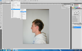
This then takes you into a new window where you can change the distortion levels, alignment and both vertical and horizontal perspective views. For my image I used the horizontal perspective to make my face appear straighter in the shot.
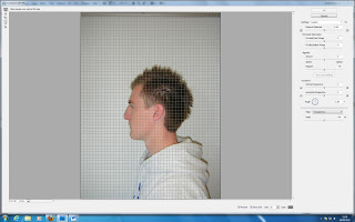
Once we were happy with our corrections we applied the same to the other image. Again going through the same procedure.
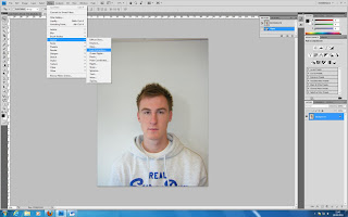
Now that we were happy with both our profile images we had to import one into the same workspace as the other. Next was to change the canvas size so that both images could find next to each other on one canvas horizontally. I changed the canvas size width by 200%.
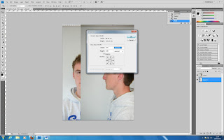
Once our images were side by side the next task was to make sure that our main features were level with another. By setting one images opacity to 70% allowed us to overlap the images and work out how and where we had to change areas to make them level. To see if they were level a ruler was used and this can be done by going to view/ rulers, and dragging the horizontal rule at the top down to a point on our face. For mine I chose the eyes.
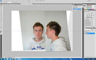
After many problems and altercations, through using the image rotation and scaling techniques I finally managed to get at least my main features of the eyes, nose, lower ear, mouth and chin level. These can be seen below with the use of the rule lines.
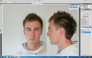
By using these lines and matching the two images together will allow us when modelling to have an accurate guideline to follow and provide a more realistic and better rendered final image. This image will also help with the next step of drawing topology lines.
No comments:
Post a Comment